Showing posts with label Filters. Show all posts

Monday, 17 June 2019

Alphabet Browsing (Filter) Hack


Recently I've been requested to created a dimension-heavy dashboard and provide various ways for users to search for information. Other than the obvious wildcard search boxes and single/multi select filters, I created an alphabet that allowed users to click on and quickly navigate to a specific alphabet letter.

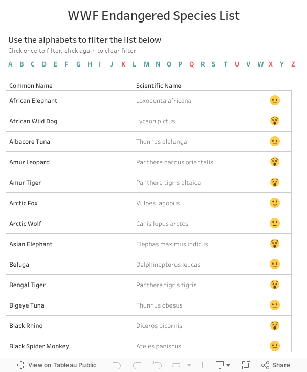
Using the WWF endangered species data as an example, at first, I simply used the LEFT function, created a calculated field with the first letter of each 'common name' and set them as the filter, but what happens is that the letters that does not correspond with a 'common name' (in this case: K, Q, U, X, and Z) simply didn't show up.


There are a few downsides to this, one, it is simply a filter and not an alphabet browser, two, if more data gets added in the future, the width of the alphabets will increase, hence making it hard for me to determine the final width I should aim for. In my real life scenario, I didn't have enough space to put all the alphabets in a single row, and had to find a way to cut them into two 13 letter rows. The goal was to create a filter with a full set of alphabet letters, and color the letters that has data a certain color, and the ones that don't another color.

After some thought, the solution came to me. What I ended up doing was creating a separate data source (using Excel) that contains all the letters in the alphabet, then blended the data source together to determine which letters has a 'common name' (teal) and which doesn't (red).


Details:
  • Drag the Alphabets pill from the List of Alphabets data source to Columns and Text
  • Drag the Alphabets pill from the Main data source to Color
  • Color null red, color all other letters teal
If you are working with your final data source, this is pretty much all you have to do. However, in my case, I had to develop the dashboard using test data from a test server, then another team actually moves my dashboard from the test server to UAT, then finally connecting to production. The problem with this, is that when a new letter appears (from null), Tableau will automatically pick a colour from the chosen colour palette, and 9 out of 10 times it won't be teal.

Not knowing which letters will be Null and which letter will be populated, this is what I did:

  • In test server, using existing data, colour null values one colour (red) and non-null values another colour (teal)
  • Use the user interface and manually created dummy data for each of the letters that were null. In this data set, it would be K, Q, U, X and Z.
  • Go back to tableau. You now see no nulls as every letter has a value. You should see that K, Q, U, X, and Z are all various colours. Colour them all teal.
  • Connect to final data source, and the colours updated accordingly. Since we coloured all the letters teal, whenever a letter has a value, it automatically colours it teal. And since we coloured null values red, whenever there isn't a null value, it colours it red!

The last step is to set the proper dashboard action to enable the alphabets to filter the results, and you're done!


Hopefully this helps you. It's just a cute little hack that make dashboard that much more user friendly.

Thursday, 21 December 2017

Universal Search Bar and URL Action


How to navigate around this dashboard:

  1. Type the name of a director or actor/actress and/or type a plot keyword, hit enter
  2. Click on any movie in the table under the search bars (hover over the menu icon "..." for more info)
  3. The movie title of your selection should show up in the rectangular box (large font), hover over it (also other information about the movie of your choice should be displayed)
  4. Your movie, if in the right format, should show up in the Wikipedia page underneath (more about this below).


This was a super fun dashboard to make. I had already decided that I was going to make a dashboard on universal search bars and just had to find the right data set (this part of the work always takes the longest). Luckily I came across this movies data set on Kaggle. After massaging the data a bit, I was able to make the dashboard I had envisioned.


Universal Search Bar

The universal search bar isn't actually "universal", but instead, it allows users to search across a defined number of columns. In the case of a movies data set, 2 types of searches stood out for me:

  • People, and
  • Keywords

In this data set, there are 4 people columns (director, actors 1-3) and 5 plot keyword columns. I will walk through setting up the universal search bar using the people columns.

First, set up a parameter; I called mine "People Search Parameter". Set to "string" and delete the current value.


Then set up a Boolean calculated field, which I called "Universal People Search Filter". Syntax is as follows:

CONTAINS(LOWER([First People Field]),LOWER([People Search Parameter]))
OR
CONTAINS(LOWER([Second People Field]),LOWER([People Search Parameter]))
OR
CONTAINS(LOWER([Nth People Field]),LOWER([People Search Parameter]))


Drag this calculated filed to filter and select only "TRUE", and away we go. Next time anyone types a name into the parameter, anything in these columns that contain the text will show up.


URL Action

To get your URL action to work within your dashboard, simply drag a web page object onto your dashboard. Don't worry too much about the URL that you input here.


Then create a dashboard action by clicking on "Dashboard" → "Actions..." → "Add Action >" → "URL"


I knew I wanted to link to Wikipedia, and needed to know how the links looked before I continued on. So, I first opened a browser and did a test search for a film in Wikipedia, and copied the URL using the same format in the URL field. The format of most recent movies were as follows:

https://en.wikipedia.org/wiki/<Movie Title>_(<Title Year> film)

But the design of a regular webpage was too wide for my tiny blog-sized dashboard. So I went the mobile route:

https://en.m.wikipedia.org/wiki/<Movie Title>_(<Title Year> film)

An important thing to note is that this format is locked down. If any movies were listed in Wikipedia under a different format, the URL action will result in a page error. 


For instance, the web page for the movie "2 Fast 2 Furious" on Wikipedia is actually:

https://en.m.wikipedia.org/wiki/2_Fast_2_Furious

and not

https://en.m.wikipedia.org/wiki/2 Fast 2 Furious_(2003 film)


Therefore, the URL action did not work on the dashboard. This is something to keep in mind when choosing web pages you want to link to. Web sites that has consistent naming conventions will generally work better, and maximize the success of your URL actions.


A good one is a simple Google search URL, the generic URL is as follows:

https://www.google.ca/search?q=<search term 1>+<search term 2>+<search term n>

In addition to the fields that you have in your data set, you can add other search terms in combination with your fields to better direct your search results, such as:

https://www.google.ca/search?q=<Movie Title>+film


Now that you have your universal search bar and your URL action set up, the rest is just some creative formatting. I hope these tips help you with your next task, and that this dashboard shows how even with a tiny 600 X 800 dashboard, you can still pack a lot in. Keep on playing!

Wednesday, 1 March 2017

Parameters VS Filters

I've been using Parameters a lot these days. The use is so broad I just can't stay away from it. Tableau made filter super easy to use, but sometimes in addition to filters I might want to display the graph differently, this is when parameters come in super handy. It was quite intimidating the first few times I've had to use parameters, but once I got the hang of it, it became one of those tools I come back to over and over again.

This is a simple dashboard I made to illustrate the difference between parameters and filters.
Disclaimer: there are other ways of using parameters, this is just one of the most common ways I've had to use them for.


First, I got a simple demographic data set from UN Data, chose the last 3 year for Canada and cleaned it up a bit (2012 data was not part of the data set). This is how my data source looks like:


I knew I wanted to see population over time as a bar graph, so I dragged:

  • Year to Columns
  • SUM(Value) to Rows

I then wanted to stack the bar as well as filter the bars a few ways. So I created a parameter and 3 quick filters.

Add Filters
  • Simply select the filters you'd like using quick filters


Add Parameters
  • Create a parameter first. I called mine "Stack Bar Graph By" (not the best name I know), data type is String, and I used a List

  • Create a calculated field that uses the parameters. I called mine "Stack Bar Filter", and here's the syntax I used:

          CASE [Stack Bar Graph By]

          WHEN '1' THEN [Age]
          WHEN '2' THEN [Marital status]
          WHEN '3' THEN [Sex]
          WHEN '4' THEN NULL

          END


  • Next, drag the calculated field to Color, and Show Parameter Control

The Difference

The Age filter on the default view is limited to ages 25 - 44. If you select all the age ranges, you will see a much busier graph. The same is with the Marital Status filter. I've limited the default to just 3 statuses, this filters out all the people with the other 3 statuses that's not chosen.

Default View with All Age Groups - Parameter on Age

Note that when you select all the ages, additional colours appeared in the graph (above), but when you select all the marital statuses, the individual portions of the existing colors simply increased in size. This is because the default parameter is on Age.

If you change the parameter to Marital Status, and then select all the marital statuses, you will now see additional colors in the bar graph.

All Marital Statuses - Parameter on Marital Status

Depending on the purpose of the graph/dashboard, filters and parameters provide their own purpose and can compliment each other. In this case, the filters let you look at a specific subset of the entire population by Age, Marital Status, and Sex, whereas the parameters let you see the proportions between each of the subsets in relation to one another.

Other examples of uses for parameters I've used in the past include:
  • Switching between a bar graph and a line graph
  • Change the time unit the graph is laid out (day/week/month/year)
  • Switching between a few different unit of measurements (ie. meter vs inch)
  • Basically, switch any of the pills in any of the shelves (ex. rows, columns, colours...etc.)