More Hans Rosling on TED: https://www.ted.com/search?q=rosling
Wednesday, 10 October 2018
Data Visualization & Data Design Talks
Great talks on data visualization and information design you should watch.
More Hans Rosling on TED: https://www.ted.com/search?q=rosling
More Hans Rosling on TED: https://www.ted.com/search?q=rosling

Thursday, 21 December 2017
Universal Search Bar and URL Action
How to navigate around this dashboard:
- Type the name of a director or actor/actress and/or type a plot keyword, hit enter
- Click on any movie in the table under the search bars (hover over the menu icon "..." for more info)
- The movie title of your selection should show up in the rectangular box (large font), hover over it (also other information about the movie of your choice should be displayed)
- Your movie, if in the right format, should show up in the Wikipedia page underneath (more about this below).
This was a super fun dashboard to make. I had already decided that I was going to make a dashboard on universal search bars and just had to find the right data set (this part of the work always takes the longest). Luckily I came across this movies data set on Kaggle. After massaging the data a bit, I was able to make the dashboard I had envisioned.
Universal Search Bar
The universal search bar isn't actually "universal", but instead, it allows users to search across a defined number of columns. In the case of a movies data set, 2 types of searches stood out for me:
- People, and
- Keywords
In this data set, there are 4 people columns (director, actors 1-3) and 5 plot keyword columns. I will walk through setting up the universal search bar using the people columns.
First, set up a parameter; I called mine "People Search Parameter". Set to "string" and delete the current value.

Then set up a Boolean calculated field, which I called "Universal People Search Filter". Syntax is as follows:
CONTAINS(LOWER([First People Field]),LOWER([People Search Parameter]))
OR
CONTAINS(LOWER([Second People Field]),LOWER([People Search Parameter]))
OR
CONTAINS(LOWER([Nth People Field]),LOWER([People Search Parameter]))

Drag this calculated filed to filter and select only "TRUE", and away we go. Next time anyone types a name into the parameter, anything in these columns that contain the text will show up.
URL Action
To get your URL action to work within your dashboard, simply drag a web page object onto your dashboard. Don't worry too much about the URL that you input here.

Then create a dashboard action by clicking on "Dashboard" → "Actions..." → "Add Action >" → "URL"


I knew I wanted to link to Wikipedia, and needed to know how the links looked before I continued on. So, I first opened a browser and did a test search for a film in Wikipedia, and copied the URL using the same format in the URL field. The format of most recent movies were as follows:
https://en.wikipedia.org/wiki/<Movie Title>_(<Title Year> film)
But the design of a regular webpage was too wide for my tiny blog-sized dashboard. So I went the mobile route:
https://en.m.wikipedia.org/wiki/<Movie Title>_(<Title Year> film)
An important thing to note is that this format is locked down. If any movies were listed in Wikipedia under a different format, the URL action will result in a page error.

https://en.m.wikipedia.org/wiki/2_Fast_2_Furious
and not
https://en.m.wikipedia.org/wiki/2 Fast 2 Furious_(2003 film)

Therefore, the URL action did not work on the dashboard. This is something to keep in mind when choosing web pages you want to link to. Web sites that has consistent naming conventions will generally work better, and maximize the success of your URL actions.
https://www.google.ca/search?q=<search term 1>+<search term 2>+<search term n>
In addition to the fields that you have in your data set, you can add other search terms in combination with your fields to better direct your search results, such as:
https://www.google.ca/search?q=<Movie Title>+film
Now that you have your universal search bar and your URL action set up, the rest is just some creative formatting. I hope these tips help you with your next task, and that this dashboard shows how even with a tiny 600 X 800 dashboard, you can still pack a lot in. Keep on playing!
Wednesday, 9 August 2017
Using HTML as Your Datasource
I'm not a programmer and I don't have an IT background, so when I heard of this method of connection, I was super stoked to try it out!
In a nutshell, you would structure your data connections this way:
Selecting Your Source - The Web Page
Obviously it would be best to connect to a web page that updates over time. Meaning, the same URL will hold data that updates and thus update your data source.
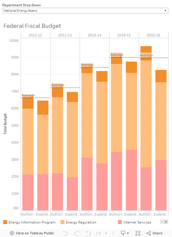
I am working on a workbook related to the Canadian Federal budget and how they spend our hard earn tax dollars, so I connected my Google Sheets to the Authorities and Expenditures by Program page.

This is, however, not a good example as the government posts by groupings of years. It is shown in the URL and thus I don't believe this particular page will be updated with new information but rather, the new information will be published onto a new page that has a new URL altogether. Having the year in the URL kind of gave it away.

A better web page to connect to would be, for instance, like a Wikipedia page where tables are updated without the URL changing.
The Formula & The Table
In Google Sheets, use the following syntax:
The URL is easy, simply copy and paste.
The query is "table" or "list depending on what type of structure contains the desired data.
The index, however, may take a little bit of work.
Open up HTML viewer and look for all the "tables" until you find the table in question. For instance, if your table is the 3rd out of 4 tables, you would put "3" in the formula for index. The federal expenditure web page only had 1 table so I put "1" for my formula.

*Open HTML in Google Chrome by going to Settings à More Tools à Developer Tools
Chrome: https://developers.google.com/web/tools/chrome-devtools/
IE: https://msdn.microsoft.com/en-us/library/dd565627(v=vs.85).aspx#htmltool
Firefox: https://developer.mozilla.org/en-US/docs/Tools/Page_Inspector/How_to/Examine_and_edit_HTML
In the end, my full formula looked like this:
You'll see the formula load for a few seconds, and then the table should load.


Connect to Tableau
Open Tableau and connect to Google Sheets. A pop up window will prompt you to sign into your google account, then it should connect to Google Drive automatically. You can also copy and paste the URL of your Google Sheet directly in the search bar.

In a nutshell, you would structure your data connections this way:
 |
| HTML to Google Sheets to Tableau |
Selecting Your Source - The Web Page
Obviously it would be best to connect to a web page that updates over time. Meaning, the same URL will hold data that updates and thus update your data source.
I am working on a workbook related to the Canadian Federal budget and how they spend our hard earn tax dollars, so I connected my Google Sheets to the Authorities and Expenditures by Program page.

This is, however, not a good example as the government posts by groupings of years. It is shown in the URL and thus I don't believe this particular page will be updated with new information but rather, the new information will be published onto a new page that has a new URL altogether. Having the year in the URL kind of gave it away.

A better web page to connect to would be, for instance, like a Wikipedia page where tables are updated without the URL changing.
The Formula & The Table
In Google Sheets, use the following syntax:
= IMPORTHTML(url, query, index)
The URL is easy, simply copy and paste.
The query is "table" or "list depending on what type of structure contains the desired data.
The index, however, may take a little bit of work.
Open up HTML viewer and look for all the "tables" until you find the table in question. For instance, if your table is the 3rd out of 4 tables, you would put "3" in the formula for index. The federal expenditure web page only had 1 table so I put "1" for my formula.

*Open HTML in Google Chrome by going to Settings à More Tools à Developer Tools
Chrome: https://developers.google.com/web/tools/chrome-devtools/
IE: https://msdn.microsoft.com/en-us/library/dd565627(v=vs.85).aspx#htmltool
Firefox: https://developer.mozilla.org/en-US/docs/Tools/Page_Inspector/How_to/Examine_and_edit_HTML
In the end, my full formula looked like this:
=IMPORTHTML("https://www.canada.ca/en/treasury-board-secretariat/services/planned-government-spending/budgets-expenditures/expenditures-program-2016.html","table",1)
You'll see the formula load for a few seconds, and then the table should load.

↓

Connect to Tableau
Open Tableau and connect to Google Sheets. A pop up window will prompt you to sign into your google account, then it should connect to Google Drive automatically. You can also copy and paste the URL of your Google Sheet directly in the search bar.

Canadian Federal Fiscal Budget by Type
Tuesday, 25 July 2017

Wednesday, 12 April 2017
Mapping & Polygons
Tableau makes mapping pretty easy. The most common ones I've seen are:
It's important to clarify, that Tableau is not a GIS tool. Although it has mapping capabilities, it can't to spatial analysis (like calculate area size or create spatial relationships). There are also limitations when it comes to drawing points with lines and polygons, though there are some workarounds. A topic for another day.
Converters
I wanted to work with Calgary communities but first, I had to find the data. I thought the City of Calgary's polygons must be super accurate, so I went to this page and got myself some community boundaries. There were 7 formats available for download, and I started with the CSV one. But I soon realized that it's not a Tableau-consumable format, so my next task was to search for a way to get any of these 7 formats into a workable format.

Through chatting with some folks at work, I discovered that there are online converters that does it for you. I'm sure there are more, but the 2 that I use are:
Both worked with the community boundaries shapefile I downloaded from the City of Calgary Open Data web site, which consisted of 4 files (.dbf, .prj, .shp, .shx). But when I was working with another project for work, the file I used had 3 sets of shapefiles zipped together (21 files of .dbf, .prj, .sbn, .sbx, .shp, .shp.xml, .shx per file). For this bundle, the Safe converter converted them into 3 neatly packaged tde.'s just fine but the Alteryx converter wasn't able to pick them up until I separated them into 3 zipped files.
Tableau Polygon 101
To draw polygons in Tableau, you need to have at least the following fields:

I then dragged "Name" to Detail, and got all the points that has a name. Which, in this case, are all the Calgary communities:

Because I wanted to draw polygons, I needed to tell Tableau the order in which the points should be connected. This is determined by the "Path", which appears in the Marks menu when I changed the graph type to Polygon. Without the order the points should be connected by, the graph defaults to this:

Drag "Path" to Path, and the communities appeared as intended:

I connected the map with the 2016 Calgary census data and the Calgary secondary suites data, did some more formatting, and this is what I got:

This map shows me which communities has more/less secondary suites, but I also want to be able to zoom into the specific communities and see the exact location of the suites. So I made a second graph using the secondary suite's longitude and latitude and some basic information I find useful (ie. address).
Here's the final result:
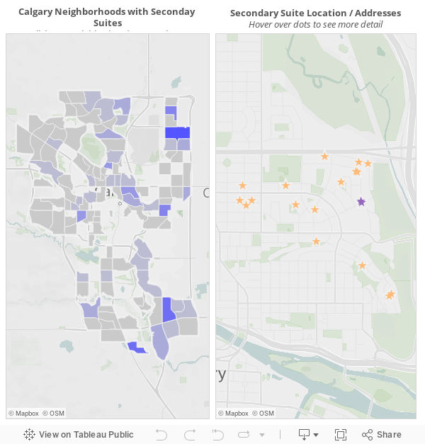
*Not sure if you noticed, but some communities (like Bridgeland/Riverside) don't have census information. This is because I used "Community Name" as the link between each data sources, so whatever community name was not an exact match will not have information about them.
BONUS - Dashboard Action: Hyperlinks
- Proportional symbol maps - ex. coloured dots on a map based on sales/profit
- Choropleth (or filled) maps - ex. coloured states based on population
See these maps and other types of maps on the Tableau online help page "Mapping in Tableau".
Tableau has most countries, states / provinces, and cities built in already (more info for the U.S. compared to other countries) so all you need to do is double click on the field and it should populate on the map. However, it's a bit of a different story when it comes to polygons, and I've been itching to try it out.
Converters
I wanted to work with Calgary communities but first, I had to find the data. I thought the City of Calgary's polygons must be super accurate, so I went to this page and got myself some community boundaries. There were 7 formats available for download, and I started with the CSV one. But I soon realized that it's not a Tableau-consumable format, so my next task was to search for a way to get any of these 7 formats into a workable format.

Through chatting with some folks at work, I discovered that there are online converters that does it for you. I'm sure there are more, but the 2 that I use are:
- Alteryx Tableau Shapefile to Polygon Converter
- Safe Software ArcGIS Shapefile to Tableau TDE - Free Online Converter
Both worked with the community boundaries shapefile I downloaded from the City of Calgary Open Data web site, which consisted of 4 files (.dbf, .prj, .shp, .shx). But when I was working with another project for work, the file I used had 3 sets of shapefiles zipped together (21 files of .dbf, .prj, .sbn, .sbx, .shp, .shp.xml, .shx per file). For this bundle, the Safe converter converted them into 3 neatly packaged tde.'s just fine but the Alteryx converter wasn't able to pick them up until I separated them into 3 zipped files.
Tableau Polygon 101
To draw polygons in Tableau, you need to have at least the following fields:
- Longitude
- Latitude
- ID (sometimes called Name)
- Order (sometimes called Path)

I then dragged "Name" to Detail, and got all the points that has a name. Which, in this case, are all the Calgary communities:

Because I wanted to draw polygons, I needed to tell Tableau the order in which the points should be connected. This is determined by the "Path", which appears in the Marks menu when I changed the graph type to Polygon. Without the order the points should be connected by, the graph defaults to this:

Drag "Path" to Path, and the communities appeared as intended:

I connected the map with the 2016 Calgary census data and the Calgary secondary suites data, did some more formatting, and this is what I got:

This map shows me which communities has more/less secondary suites, but I also want to be able to zoom into the specific communities and see the exact location of the suites. So I made a second graph using the secondary suite's longitude and latitude and some basic information I find useful (ie. address).
Here's the final result:
*Not sure if you noticed, but some communities (like Bridgeland/Riverside) don't have census information. This is because I used "Community Name" as the link between each data sources, so whatever community name was not an exact match will not have information about them.
BONUS - Dashboard Action: Hyperlinks
I added a "google search" hyperlink action in the Secondary Suite Location / Address graph so I can quickly look up information about the community I'm looking at.

This is done through dashboard actions → add action (URL).Simply type in any search term in google, then replace the term with the field in your dashboard that you want google to search by (ie. "community").
Friday, 7 April 2017

Saturday, 11 March 2017
The Impact of Different Types of Visualization
My manager shared a great video by the Harvard Business Review on the impact of visualizations, which could have different effects depending on what you show and how you show it.
Here are my notes:
"People read charts like they read books" Scott said. There are a lot of things you can't control and information is read in the order it was presented, thus making building charts difficult at times. People also naturally gravitate toward things that stand out, like colours and outliers, and almost immediately start to form narratives.
He used 5 examples to talk about misleading charts:
1. Ideas that Don't Exist
This chart, presented in congress, shows as if "abortions have risen above cancer screening", Scott said, calling it "a deliberate attempt to mislead".

Personally, I always go back to the statistics rule of "correlation does not imply causation".
2. Look at Axes Labels
Scott used this graph to illustrate how deceiving a cumulative bar chart can be, showing growth when there was none.

In fact, when you separate out the revenue individually, there is a decline.

Basically, this is a very ill-suited chart for the message.
3. Pay Attention to the Spacing
Scott argues that perhaps there are no truly objective charts, but rather, each serves it's own purpose.
When a chart has a much wider spacing, the fluctuation of the line does not appear as drastic as if the same chart had a much narrower spacing.
Most of the time, the decision as to how a chart is presented is arbitrary and there is no real standard. The important thing is to make sure a chart is used appropriately.
4. Truncated Y Axis
Truncated Y axes create a more dramatic story, which sometimes could be misleading. This chart looks as if the average job satisfaction really plummets throughout an employee's career.

However, if the entire Y axis is shown, the decrease looks unremarkable.

Scott said that some scientists may look at very limited ranges of data where truncating the Y axis becomes appropriate. There are no hard rules, just think about whether you are exaggerating the story unnecessarily.
5. Dual (Y) Axes
Dual axes charts measure 2 data points in the same visual space.

First of all, although we're looking at care sales between Tesla and other brands, the 2 charts have completely different units (one in percentage increase, the other in dollar increase). Then, when looking at the green line, proportionally, it looks as if Tesla shares are projected to increase 25% (a quarter of the chart) when in reality, it will only increased about 2% (Y axis on the left does not contain the entire 100%).

Since we're looking at Tesla vehicle sales compared to other vehicle sales, Scott thinks this chart is a more appropriate representation.
Q: Common Decision Points?
This depends on the data you choose to show. For example, the following graph shows the sales of vinyl records between 1993 and 2014. It appears, quite justly so, that the sales of vinyl records have "sky-rocketed".


Q: How do you know when you've crossed the line?
Use the golden rule, and ask yourself whether you feel deceived or mislead by the chart. When choosing the right representation, ask yourself if you are "zooming in on the message or are you distorting the truth".
Q: How do you know charts are accurate?
Evaluate all the ways charts can be misleading. For example, pay attention to whether the Y axes are truncated and the story is in fact more dramatic than it really is. Or when encountering a dual axes chart, analyze the data individually / separately first before comparing the 2 together.
See Scott's book Good Charts: The HBR Guide to Making Smarter, More Persuasive Data Visualizations for more info.
Here are my notes:
DESIGNING PERSUASIVE CHARTS with Scott Berinato
"People read charts like they read books" Scott said. There are a lot of things you can't control and information is read in the order it was presented, thus making building charts difficult at times. People also naturally gravitate toward things that stand out, like colours and outliers, and almost immediately start to form narratives.
He used 5 examples to talk about misleading charts:
1. Ideas that Don't Exist
This chart, presented in congress, shows as if "abortions have risen above cancer screening", Scott said, calling it "a deliberate attempt to mislead".
Personally, I always go back to the statistics rule of "correlation does not imply causation".
2. Look at Axes Labels
Scott used this graph to illustrate how deceiving a cumulative bar chart can be, showing growth when there was none.

In fact, when you separate out the revenue individually, there is a decline.

Basically, this is a very ill-suited chart for the message.
3. Pay Attention to the Spacing
Scott argues that perhaps there are no truly objective charts, but rather, each serves it's own purpose.
 |
| Wide spacing between "Years" |
When a chart has a much wider spacing, the fluctuation of the line does not appear as drastic as if the same chart had a much narrower spacing.
 |
| Narrow spacing between "Years" |
4. Truncated Y Axis
Truncated Y axes create a more dramatic story, which sometimes could be misleading. This chart looks as if the average job satisfaction really plummets throughout an employee's career.

However, if the entire Y axis is shown, the decrease looks unremarkable.

Scott said that some scientists may look at very limited ranges of data where truncating the Y axis becomes appropriate. There are no hard rules, just think about whether you are exaggerating the story unnecessarily.
5. Dual (Y) Axes
Dual axes charts measure 2 data points in the same visual space.

First of all, although we're looking at care sales between Tesla and other brands, the 2 charts have completely different units (one in percentage increase, the other in dollar increase). Then, when looking at the green line, proportionally, it looks as if Tesla shares are projected to increase 25% (a quarter of the chart) when in reality, it will only increased about 2% (Y axis on the left does not contain the entire 100%).

Since we're looking at Tesla vehicle sales compared to other vehicle sales, Scott thinks this chart is a more appropriate representation.
Q: Common Decision Points?
This depends on the data you choose to show. For example, the following graph shows the sales of vinyl records between 1993 and 2014. It appears, quite justly so, that the sales of vinyl records have "sky-rocketed".

However, if you start the graph in 1973, then you'll see that the "peak" is not a peak at all.

Scott then compared the sales of vinyl with the sales of other physical/digital/streaming album sales, and the proportions becomes apparent.

Q: How do you know when you've crossed the line?
Use the golden rule, and ask yourself whether you feel deceived or mislead by the chart. When choosing the right representation, ask yourself if you are "zooming in on the message or are you distorting the truth".
Q: How do you know charts are accurate?
Evaluate all the ways charts can be misleading. For example, pay attention to whether the Y axes are truncated and the story is in fact more dramatic than it really is. Or when encountering a dual axes chart, analyze the data individually / separately first before comparing the 2 together.
See Scott's book Good Charts: The HBR Guide to Making Smarter, More Persuasive Data Visualizations for more info.
Subscribe to:
Posts (Atom)