
Friday, 7 April 2017

Saturday, 11 March 2017
The Impact of Different Types of Visualization
My manager shared a great video by the Harvard Business Review on the impact of visualizations, which could have different effects depending on what you show and how you show it.
Here are my notes:
"People read charts like they read books" Scott said. There are a lot of things you can't control and information is read in the order it was presented, thus making building charts difficult at times. People also naturally gravitate toward things that stand out, like colours and outliers, and almost immediately start to form narratives.
He used 5 examples to talk about misleading charts:
1. Ideas that Don't Exist
This chart, presented in congress, shows as if "abortions have risen above cancer screening", Scott said, calling it "a deliberate attempt to mislead".

Personally, I always go back to the statistics rule of "correlation does not imply causation".
2. Look at Axes Labels
Scott used this graph to illustrate how deceiving a cumulative bar chart can be, showing growth when there was none.

In fact, when you separate out the revenue individually, there is a decline.

Basically, this is a very ill-suited chart for the message.
3. Pay Attention to the Spacing
Scott argues that perhaps there are no truly objective charts, but rather, each serves it's own purpose.
When a chart has a much wider spacing, the fluctuation of the line does not appear as drastic as if the same chart had a much narrower spacing.
Most of the time, the decision as to how a chart is presented is arbitrary and there is no real standard. The important thing is to make sure a chart is used appropriately.
4. Truncated Y Axis
Truncated Y axes create a more dramatic story, which sometimes could be misleading. This chart looks as if the average job satisfaction really plummets throughout an employee's career.

However, if the entire Y axis is shown, the decrease looks unremarkable.

Scott said that some scientists may look at very limited ranges of data where truncating the Y axis becomes appropriate. There are no hard rules, just think about whether you are exaggerating the story unnecessarily.
5. Dual (Y) Axes
Dual axes charts measure 2 data points in the same visual space.

First of all, although we're looking at care sales between Tesla and other brands, the 2 charts have completely different units (one in percentage increase, the other in dollar increase). Then, when looking at the green line, proportionally, it looks as if Tesla shares are projected to increase 25% (a quarter of the chart) when in reality, it will only increased about 2% (Y axis on the left does not contain the entire 100%).

Since we're looking at Tesla vehicle sales compared to other vehicle sales, Scott thinks this chart is a more appropriate representation.
Q: Common Decision Points?
This depends on the data you choose to show. For example, the following graph shows the sales of vinyl records between 1993 and 2014. It appears, quite justly so, that the sales of vinyl records have "sky-rocketed".


Q: How do you know when you've crossed the line?
Use the golden rule, and ask yourself whether you feel deceived or mislead by the chart. When choosing the right representation, ask yourself if you are "zooming in on the message or are you distorting the truth".
Q: How do you know charts are accurate?
Evaluate all the ways charts can be misleading. For example, pay attention to whether the Y axes are truncated and the story is in fact more dramatic than it really is. Or when encountering a dual axes chart, analyze the data individually / separately first before comparing the 2 together.
See Scott's book Good Charts: The HBR Guide to Making Smarter, More Persuasive Data Visualizations for more info.
Here are my notes:
DESIGNING PERSUASIVE CHARTS with Scott Berinato
"People read charts like they read books" Scott said. There are a lot of things you can't control and information is read in the order it was presented, thus making building charts difficult at times. People also naturally gravitate toward things that stand out, like colours and outliers, and almost immediately start to form narratives.
He used 5 examples to talk about misleading charts:
1. Ideas that Don't Exist
This chart, presented in congress, shows as if "abortions have risen above cancer screening", Scott said, calling it "a deliberate attempt to mislead".
Personally, I always go back to the statistics rule of "correlation does not imply causation".
2. Look at Axes Labels
Scott used this graph to illustrate how deceiving a cumulative bar chart can be, showing growth when there was none.

In fact, when you separate out the revenue individually, there is a decline.

Basically, this is a very ill-suited chart for the message.
3. Pay Attention to the Spacing
Scott argues that perhaps there are no truly objective charts, but rather, each serves it's own purpose.
 |
| Wide spacing between "Years" |
When a chart has a much wider spacing, the fluctuation of the line does not appear as drastic as if the same chart had a much narrower spacing.
 |
| Narrow spacing between "Years" |
4. Truncated Y Axis
Truncated Y axes create a more dramatic story, which sometimes could be misleading. This chart looks as if the average job satisfaction really plummets throughout an employee's career.

However, if the entire Y axis is shown, the decrease looks unremarkable.

Scott said that some scientists may look at very limited ranges of data where truncating the Y axis becomes appropriate. There are no hard rules, just think about whether you are exaggerating the story unnecessarily.
5. Dual (Y) Axes
Dual axes charts measure 2 data points in the same visual space.

First of all, although we're looking at care sales between Tesla and other brands, the 2 charts have completely different units (one in percentage increase, the other in dollar increase). Then, when looking at the green line, proportionally, it looks as if Tesla shares are projected to increase 25% (a quarter of the chart) when in reality, it will only increased about 2% (Y axis on the left does not contain the entire 100%).

Since we're looking at Tesla vehicle sales compared to other vehicle sales, Scott thinks this chart is a more appropriate representation.
Q: Common Decision Points?
This depends on the data you choose to show. For example, the following graph shows the sales of vinyl records between 1993 and 2014. It appears, quite justly so, that the sales of vinyl records have "sky-rocketed".

However, if you start the graph in 1973, then you'll see that the "peak" is not a peak at all.

Scott then compared the sales of vinyl with the sales of other physical/digital/streaming album sales, and the proportions becomes apparent.

Q: How do you know when you've crossed the line?
Use the golden rule, and ask yourself whether you feel deceived or mislead by the chart. When choosing the right representation, ask yourself if you are "zooming in on the message or are you distorting the truth".
Q: How do you know charts are accurate?
Evaluate all the ways charts can be misleading. For example, pay attention to whether the Y axes are truncated and the story is in fact more dramatic than it really is. Or when encountering a dual axes chart, analyze the data individually / separately first before comparing the 2 together.
See Scott's book Good Charts: The HBR Guide to Making Smarter, More Persuasive Data Visualizations for more info.
Wednesday, 1 March 2017
Parameters VS Filters
I've been using Parameters a lot these days. The use is so broad I just can't stay away from it. Tableau made filter super easy to use, but sometimes in addition to filters I might want to display the graph differently, this is when parameters come in super handy. It was quite intimidating the first few times I've had to use parameters, but once I got the hang of it, it became one of those tools I come back to over and over again.
This is a simple dashboard I made to illustrate the difference between parameters and filters.
Disclaimer: there are other ways of using parameters, this is just one of the most common ways I've had to use them for.

First, I got a simple demographic data set from UN Data, chose the last 3 year for Canada and cleaned it up a bit (2012 data was not part of the data set). This is how my data source looks like:

I knew I wanted to see population over time as a bar graph, so I dragged:
I then wanted to stack the bar as well as filter the bars a few ways. So I created a parameter and 3 quick filters.
Add Filters

Add Parameters


The Difference
The Age filter on the default view is limited to ages 25 - 44. If you select all the age ranges, you will see a much busier graph. The same is with the Marital Status filter. I've limited the default to just 3 statuses, this filters out all the people with the other 3 statuses that's not chosen.
Note that when you select all the ages, additional colours appeared in the graph (above), but when you select all the marital statuses, the individual portions of the existing colors simply increased in size. This is because the default parameter is on Age.
If you change the parameter to Marital Status, and then select all the marital statuses, you will now see additional colors in the bar graph.
Depending on the purpose of the graph/dashboard, filters and parameters provide their own purpose and can compliment each other. In this case, the filters let you look at a specific subset of the entire population by Age, Marital Status, and Sex, whereas the parameters let you see the proportions between each of the subsets in relation to one another.
Other examples of uses for parameters I've used in the past include:
This is a simple dashboard I made to illustrate the difference between parameters and filters.
Disclaimer: there are other ways of using parameters, this is just one of the most common ways I've had to use them for.
First, I got a simple demographic data set from UN Data, chose the last 3 year for Canada and cleaned it up a bit (2012 data was not part of the data set). This is how my data source looks like:

I knew I wanted to see population over time as a bar graph, so I dragged:
- Year to Columns
- SUM(Value) to Rows
I then wanted to stack the bar as well as filter the bars a few ways. So I created a parameter and 3 quick filters.
Add Filters
- Simply select the filters you'd like using quick filters

Add Parameters
- Create a parameter first. I called mine "Stack Bar Graph By" (not the best name I know), data type is String, and I used a List

- Create a calculated field that uses the parameters. I called mine "Stack Bar Filter", and here's the syntax I used:
CASE [Stack Bar Graph By]
WHEN '1' THEN [Age]
WHEN '2' THEN [Marital status]
WHEN '3' THEN [Sex]
WHEN '4' THEN NULL
END

- Next, drag the calculated field to Color, and Show Parameter Control
The Difference
The Age filter on the default view is limited to ages 25 - 44. If you select all the age ranges, you will see a much busier graph. The same is with the Marital Status filter. I've limited the default to just 3 statuses, this filters out all the people with the other 3 statuses that's not chosen.
 |
| Default View with All Age Groups - Parameter on Age |
Note that when you select all the ages, additional colours appeared in the graph (above), but when you select all the marital statuses, the individual portions of the existing colors simply increased in size. This is because the default parameter is on Age.
If you change the parameter to Marital Status, and then select all the marital statuses, you will now see additional colors in the bar graph.
 |
| All Marital Statuses - Parameter on Marital Status |
Depending on the purpose of the graph/dashboard, filters and parameters provide their own purpose and can compliment each other. In this case, the filters let you look at a specific subset of the entire population by Age, Marital Status, and Sex, whereas the parameters let you see the proportions between each of the subsets in relation to one another.
Other examples of uses for parameters I've used in the past include:
- Switching between a bar graph and a line graph
- Change the time unit the graph is laid out (day/week/month/year)
- Switching between a few different unit of measurements (ie. meter vs inch)
- Basically, switch any of the pills in any of the shelves (ex. rows, columns, colours...etc.)
References: Tableau Parameter Help
Friday, 24 February 2017

Tuesday, 21 February 2017
YYC Tableau Seminar Feb. 2017
I attended the Tableau seminar in Calgary this week and learned about the Top 10 Business Intelligence Trends for 2017. In addition, Alberta Health Services and QuICR made presentations explaining how they use Tableau to enhance their day-to-day operations.
1. The Modern Business Intelligence (BI) Model
With the role of data discovery shifting from a centralize IT department to individual businesses, the modern BI (project) model means a shift from the traditional waterfall approach to an agile model.
2. Collaborative Analytics
Open data sources provide more data to discover, but also fosters a collaborative environment. When data is shared, more insight is uncovered, and better decisions can then be made (see presentation by AHS and QuICR below).
3. All Data Becomes Equal
Tableau allows users to connect to multiple data sources and does not discriminate on their size. Cross referencing data from Oracle and Excel becomes a walk in the park.
4. Self-Serve Extends to Data Preparation
According to Howard, Tableau reinvests >30% of its revenue in R&D and is working heavily on improving its data preparation usability and functions. Their hope is to extend not only the data discovery / visualization portion of the fun to (business user) self-serve, but the data preparation portion as well. With Project Maestro underway, I certainly look forward to the good days of data preparation, which are apparently still ahead of us.
5. Embedded Business Intelligence
Embedded BI will become the norm of the future, with some companies already creating seamless dashboards right on their web pages, and others, pushing the boundaries of Tableau's functionalities (such as write-back).
6. IT Becomes the Data Hero Again
The hope of self-serve is to shift IT from the role of report creators back to data enablers. Instead of being the bottle neck, IT will once again be the data hero every organization needs.
7. Work with Data in More Natural Ways
Howard spoke to this point by comparing a crosstab with a graph, explaining that as data gets presented visually, people will be able to work with data in more "natural" ways.
8. Cloud
According to Howard, Canadian companies struggle with the idea of hosting their data on the cloud due to a shortage of servers being physically in Canada. But that's changing as companies increase their physical presence in Canada (such as Amazon Web Services)
9. Advanced Analytics Becomes More Accessible
Tableau hopes that advanced analytics will become more accessible with their various platforms, enabling businesses to gain more in depth insight to their data.
10. Data Literacy Becomes a Fundamental Skill
Howard believes that data literacy will become a fundamental skill in the future, just like how the ability to use the Microsoft Office Suite has become a basic requirement to do one's job.
PRESENTATION BY AHS & QUICR
Alberta Health Services and QuICR demonstrated some of their dashboards and talked about the impact Tableau had on their day-to-day operations. These real-life applications were really interesting, and my main take-away points were:
Door to Needle - QuICR

TOP 10 BI TRENDS with Howard Morgenstern (@datacanuck)
1. The Modern Business Intelligence (BI) Model
With the role of data discovery shifting from a centralize IT department to individual businesses, the modern BI (project) model means a shift from the traditional waterfall approach to an agile model.
2. Collaborative Analytics
Open data sources provide more data to discover, but also fosters a collaborative environment. When data is shared, more insight is uncovered, and better decisions can then be made (see presentation by AHS and QuICR below).
3. All Data Becomes Equal
Tableau allows users to connect to multiple data sources and does not discriminate on their size. Cross referencing data from Oracle and Excel becomes a walk in the park.
4. Self-Serve Extends to Data Preparation
According to Howard, Tableau reinvests >30% of its revenue in R&D and is working heavily on improving its data preparation usability and functions. Their hope is to extend not only the data discovery / visualization portion of the fun to (business user) self-serve, but the data preparation portion as well. With Project Maestro underway, I certainly look forward to the good days of data preparation, which are apparently still ahead of us.
5. Embedded Business Intelligence
Embedded BI will become the norm of the future, with some companies already creating seamless dashboards right on their web pages, and others, pushing the boundaries of Tableau's functionalities (such as write-back).
6. IT Becomes the Data Hero Again
The hope of self-serve is to shift IT from the role of report creators back to data enablers. Instead of being the bottle neck, IT will once again be the data hero every organization needs.
7. Work with Data in More Natural Ways
Howard spoke to this point by comparing a crosstab with a graph, explaining that as data gets presented visually, people will be able to work with data in more "natural" ways.
8. Cloud
According to Howard, Canadian companies struggle with the idea of hosting their data on the cloud due to a shortage of servers being physically in Canada. But that's changing as companies increase their physical presence in Canada (such as Amazon Web Services)
9. Advanced Analytics Becomes More Accessible
Tableau hopes that advanced analytics will become more accessible with their various platforms, enabling businesses to gain more in depth insight to their data.
10. Data Literacy Becomes a Fundamental Skill
Howard believes that data literacy will become a fundamental skill in the future, just like how the ability to use the Microsoft Office Suite has become a basic requirement to do one's job.
PRESENTATION BY AHS & QUICR
Alberta Health Services and QuICR demonstrated some of their dashboards and talked about the impact Tableau had on their day-to-day operations. These real-life applications were really interesting, and my main take-away points were:
- More transparency through information sharing
- Greater synergy leveraged through each others' strengths
- Faster learning through knowledge / process / performance sharing
Door to Needle - QuICR
Door-to-needle is the time between a patient gets in the (hospital / treatment centre) door to when they receive treatment, and is a critical time measurement for acute ischemic stroke patients. As neurons are lost each second, a shorter door-to-needle time may mean saving a life. QuICR uses Tableau to analyze door-to-needle time across multiple locations and was able to better improve the door-to-needle time of not just locations with poorer performances, but even the better performing ones as well. The speaker said that when locations with poor performance see that a 30 minutes door-to-needle time was achievable in other locations, it gave them the confidence that they will be able to achieve that one day as well.
Friday, 17 February 2017
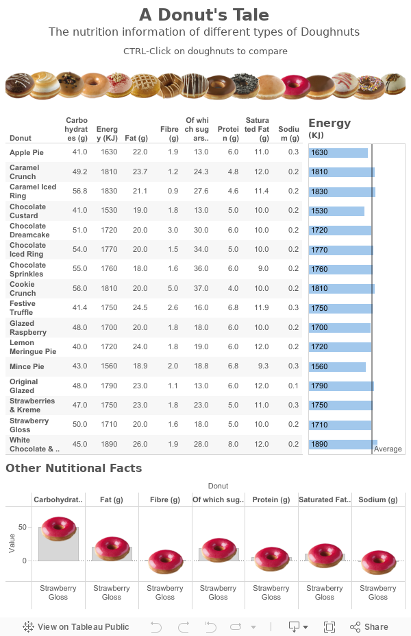
A Donut's Tale
This is a dashboard I made while taking the Tableau Visual Analytics course. The course was really worth it actually. Instead of building on top of the Fundamentals and Advance curriculum, it kind of binds everything together and challenges our way of thinking by putting our hard skills to use. Perhaps some day I'll dive into more details.
My hope is that I can continually make dashboards that not only look nice but is functional and of actual interest to me. But because I work a full time and a part time job, to be honest, it's hard to want to spend what little spare time I have left to "work" more.
But my hope is to one day work completely remotely so it is important to me. So wish me luck, and I hope to see you here again soon!
My hope is that I can continually make dashboards that not only look nice but is functional and of actual interest to me. But because I work a full time and a part time job, to be honest, it's hard to want to spend what little spare time I have left to "work" more.
But my hope is to one day work completely remotely so it is important to me. So wish me luck, and I hope to see you here again soon!
Subscribe to:
Posts (Atom)