Recently I've been requested to created a dimension-heavy dashboard and provide various ways for users to search for information. Other than the obvious wildcard search boxes and single/multi select filters, I created an alphabet that allowed users to click on and quickly navigate to a specific alphabet letter.
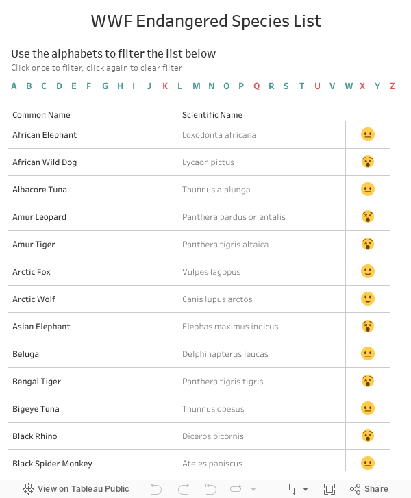
Using the WWF endangered species data as an example, at first, I simply used the LEFT function, created a calculated field with the first letter of each 'common name' and set them as the filter, but what happens is that the letters that does not correspond with a 'common name' (in this case: K, Q, U, X, and Z) simply didn't show up.


There are a few downsides to this, one, it is simply a filter and not an alphabet browser, two, if more data gets added in the future, the width of the alphabets will increase, hence making it hard for me to determine the final width I should aim for. In my real life scenario, I didn't have enough space to put all the alphabets in a single row, and had to find a way to cut them into two 13 letter rows. The goal was to create a filter with a full set of alphabet letters, and color the letters that has data a certain color, and the ones that don't another color.
After some thought, the solution came to me. What I ended up doing was creating a separate data source (using Excel) that contains all the letters in the alphabet, then blended the data source together to determine which letters has a 'common name' (teal) and which doesn't (red).

Details:
- Drag the Alphabets pill from the List of Alphabets data source to Columns and Text
- Drag the Alphabets pill from the Main data source to Color
- Color null red, color all other letters teal
If you are working with your final data source, this is pretty much all you have to do. However, in my case, I had to develop the dashboard using test data from a test server, then another team actually moves my dashboard from the test server to UAT, then finally connecting to production. The problem with this, is that when a new letter appears (from null), Tableau will automatically pick a colour from the chosen colour palette, and 9 out of 10 times it won't be teal.
Not knowing which letters will be Null and which letter will be populated, this is what I did:

Not knowing which letters will be Null and which letter will be populated, this is what I did:
- In test server, using existing data, colour null values one colour (red) and non-null values another colour (teal)
- Use the user interface and manually created dummy data for each of the letters that were null. In this data set, it would be K, Q, U, X and Z.
- Go back to tableau. You now see no nulls as every letter has a value. You should see that K, Q, U, X, and Z are all various colours. Colour them all teal.
- Connect to final data source, and the colours updated accordingly. Since we coloured all the letters teal, whenever a letter has a value, it automatically colours it teal. And since we coloured null values red, whenever there isn't a null value, it colours it red!
The last step is to set the proper dashboard action to enable the alphabets to filter the results, and you're done!

Hopefully this helps you. It's just a cute little hack that make dashboard that much more user friendly.
No comments:
Post a Comment